RAW is a free, open-source web application for creating visualizations that can be exported in SVG or PNG format and embedded into a website. Users can upload data with RAW's web interface and generate a variety of vector-based visualizations. RAW uses the D3.js library, and is maintained by the Density Design research studio at Polaitecnico di Milano.
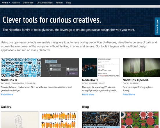
NodeBox is an open-source package of tools that includes the capacity to visualize large data sets. It utilizes interconnected nodes to generate and manipulate data visualizations, and can import data either from common programs such as Excel, or from custom user-developed importers.
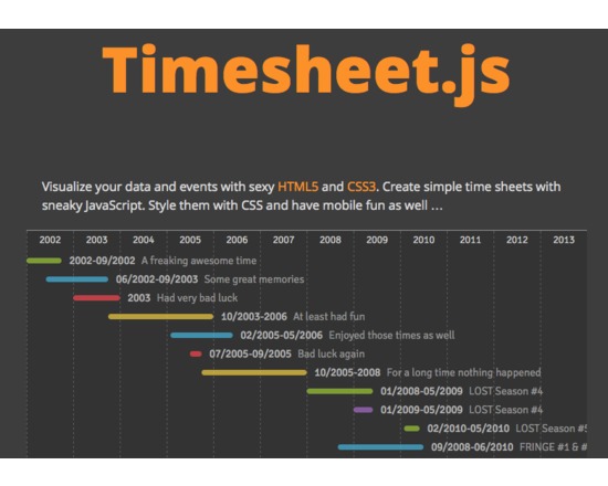
Timesheet.js is a javascript library to construct and display simple timelines. There are no external dependencies, no jQuery is needed and no Angular.JS. Timelines are rendered within your browser but do not offer the advanced interaction of products such as Timeline.js or SIMILE Timeline/Exhibit.
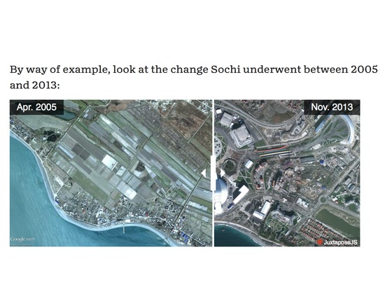
JuxtaposeJS helps tell stories by comparing two image frames, including photos and gifs. It provides a means, by a draggable pane, to see the changes and visually analyse the differences between the two images.
It’s an adaptable storytelling tool that is ideal for highlighting then/now stories that explain slow changes over time (growth of a city skyline, regrowth of a forest, etc.) or before/after stories that show the impact of single dramatic events (natural disasters, protests, wars, etc.).
JuxtaposeJS is free, easy to use, and open source. Almost anyone can use JuxtaposeJS, so long as you’ve got links to two similar pieces of media (hosted on your own server or on Flickr). Once you’ve got the links, all you need to do is copy and paste the URLs into the appropriate fields at Juxtapose.knightlab.com, modify labels as you see fit, add photo credits, and then copy and paste the resulting embed code into your site.
You’ve probably seen similar photo slider tools elsewhere. They work well, but we built JuxtaposeJS without relying on jQuery, which makes the tool more lightweight, flexible, and adaptable. It’s also accessible to any newsroom or journalist, regardless of technical skills.
It also offers some customization out of the box. You can modify the handle’s start position to highlight the area of change and choose to click the slider instead of dragging. It is responsive and works on phones and tablets with the touch or swipe of a finger.
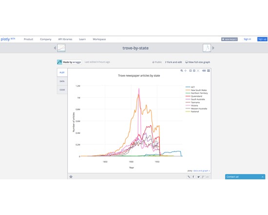
Plot.ly is a free to educational (public) user web-based graphic tool that combined leading edge visualisations with a user-friendly, guided creation experience. Accepting data in a variety of forms, it leads the user through creation and sharing and then facilitates discussion around the output objects. The data, the code and any algorithm transformations are freely accessible to all users and products are easily embedded in other documents for presentation purposes.
Plot.ly also offer their services on a paid basis to enterprise users.
plotly.js is a freely available javascript framework open for developers.
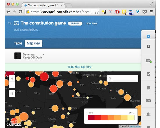
CartoDB makes data-driven map visualisation tool. It's very easy to upload a couple of spreadsheets of data, with latitudes and longitudes or addresses, and turn them into clickable markers on maps. There are several types of pre-canned visualisation, such as categories, choropleths or even animated "torque" maps. It's also a sophisticated platform allowing complex visualisations to be built up using Javascript and the CartoDB API.
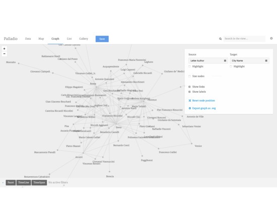
A platform for visualizing and analysing networks of historical data. Palladio is web-based tool that allows a user to upload structured data, graphically establish context within Palladio and then choose from a variety of innovative spatial, temporal and network visualisations to analyse and present research findings.