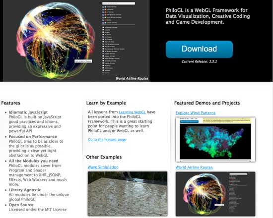
PhiloGL is an open source WebGL Framework for advanced data visualization, creative coding and game development. It includes a module system encompassing Program and Shader management, IO, XHR, JSONP, Web Worker management, Effects and Tweening, among others.
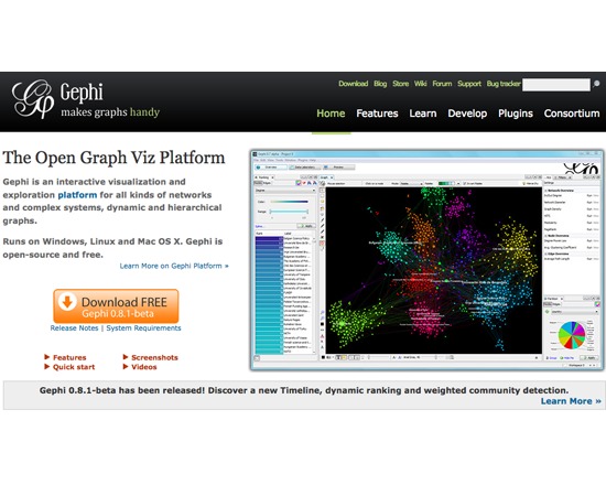
Gephi is a free, open source interactive visualization and data exploration tool. Users can manipulate the display to uncover new facets of the data, enabling intutive exploration.

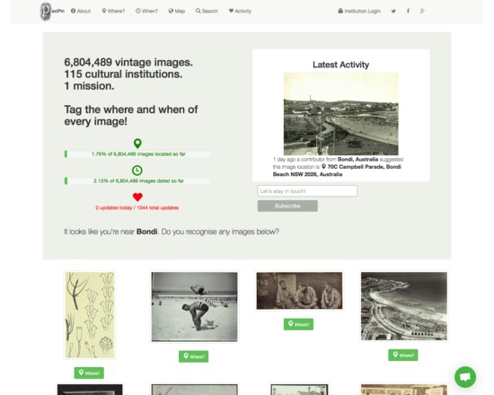
Pastpin is a cultural search engine that aims to showcase the 7M historical images available from Flickr Commons.
Users are prompted to add new metadata (geocodes, temporal data) to existing images that they may recognise based on their current location. The goal of the project is to crowdsource spatial and temporal metadata for these objects.
Visitors to the site can search or browse by using free text, or by going directly to the map and clicking on a thumbnail to view images directly.
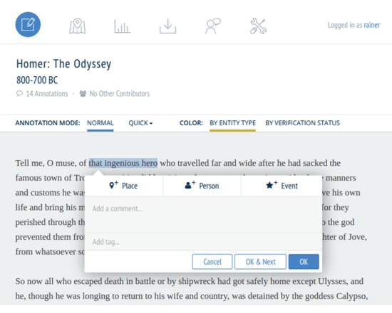
Recogito is an online platform for collaborative document annotation.
Recogito provides a personal workspace where you can upload, collect and organize your source materials - texts and images - and collaborate in their annotation and interpretation. Recogito enables you to make your work more visible on the Web more easily, and to expose the results of your research as Open Data.
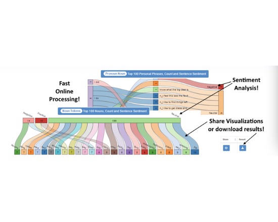
SentimentBuilder is an online tool that performs text analytics on emails, reviews, feedback, chat data or any unstructured texts via Natural Language Processing. It's the only tool where you can upload a file for processing and then visually view the results in a Sankey Flow Report to quickly identify trends, issues and strengths and then customize each view, save and share! Export any result for your own offline analysis! Try the Always Free version today and upload your own data or try one of our sample files.
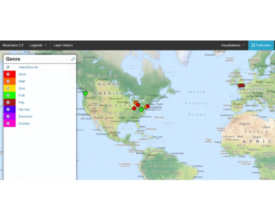
DH Press (originally called diPH) is a toolkit conceived as an easy-to-use WordPress plugin which allows potentially every kind of user to visualise and mashup historic and geographic information, documents and various types of multimedia content to develop digital humanities project.
The user cannot start from the toolkit itself, as the first step to set up a project, when the toolkit is already installed, is a CSV import. This means that the raw information has to be processed first, through any software like Microsoft Excel or Google Spreadsheet, following some conventions dictated by the toolkit, and once completed must be exported in CSV format. The file can then be imported into DH Press.
At this point, the user finally has full control over the data. First, the toolkit needs to be informed of what kind of data is in each column, as it can handle various types, such as Short Text, Long Text, Lat/Lon, Date, and Link. The steepest learning curve resides here, in the data management part, as the database must be set up very carefully, and fixing any problem later is complex. This does not mean that new users cannot approach the tool, but some basic research on data management is required to make correct use of it.
After setting up all this fields, called “motes” in the toolkit, a legend can be assigned to each of them, for example a field called “city” might contain, through multiple entries, ten different cities, and to each of those will correspond the colour chosen by the user. It is also possible to assign icons or png images instead of colours.
A single control panel then allows the user to create, set up and manage multiple visualisations of different kind, and in each of them the user can choose which information to display and how. This part is the most useful and is really straightforward.
The last section of the control panel lets the user set up custom fields for data and run a test of the whole project, and outputs detailed error information.
Following the training page, http://dhpress.org/training/, it is possible to take advantage of a pre-existing database, which can be used to quickly set up a project, so that one can instantly work on the main control panel. There is a detailed google document that guides the user through the process step by step, and also offers an even more detailed annex. A couple of hours is enough to go through all of it and get the necessary information to use it correctly. Then, any view can be quickly set up and customised in any desired way.
Overall, this toolkit is quite stable, reliable, user-friendly after the first entry barrier and gives you a varied set of tools to visualise and display a large amount of data in a neat, organised manner.
For a more detailed and personal review, please read http://claudiasartori.com/2015/01/tool-review-dh-press/
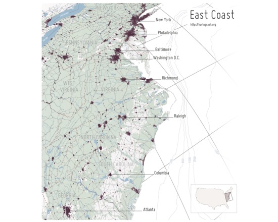
Kartograph is a pair of free and open source libraries for representing data with a spatial component on webpages or in print. The first library, Kartograph.py, is a Python library that builds lightweight vector graphic maps from either shapefiles or PostGIS tables. These graphics files can be styled either using a cascading style sheet during creation or later on the second library, Kartograph.js. The vector files can also be edited and enhanced in a vector graphics program like Adobe Illustrator.
Kartograph.js allows the user to create interactive maps for web pages and web applications, using vector graphics files and data files to both draw the basemap and the features of interest. Unlike many web-based mapping libraries, Kartograph.js requires no server or even internet connection. All of the pertinent information is in the vector and data files. The results are highly customizable and can absolutely arresting, visually.
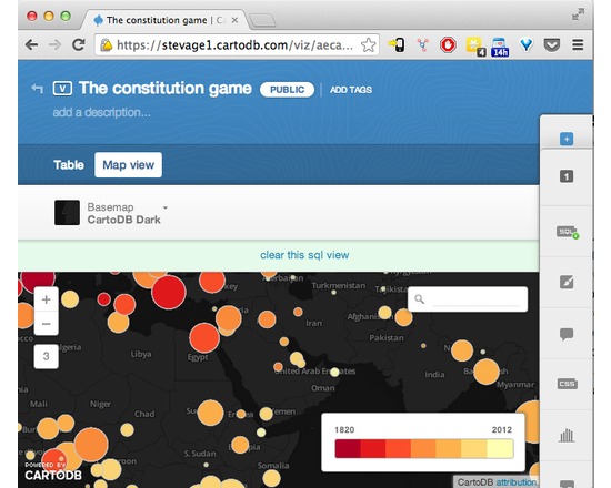
CartoDB makes data-driven map visualisation tool. It's very easy to upload a couple of spreadsheets of data, with latitudes and longitudes or addresses, and turn them into clickable markers on maps. There are several types of pre-canned visualisation, such as categories, choropleths or even animated "torque" maps. It's also a sophisticated platform allowing complex visualisations to be built up using Javascript and the CartoDB API.
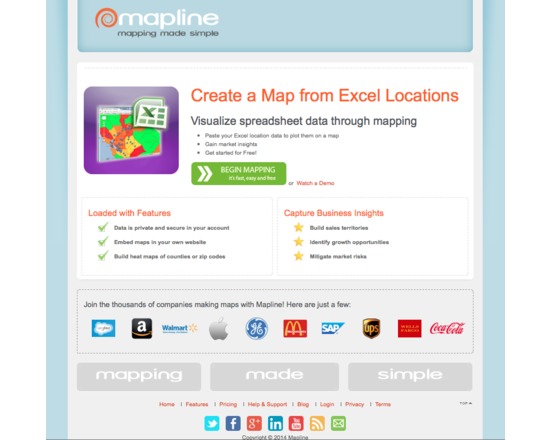
Mapline (previously Topo.ly) is a free and paid online service for capturing and geocoding spatial data from spreadsheets and creating point, territory and heat maps. It is free for limited use (quite generous) and paid when you need to map significant (we are talking substantial) datasets. It's intuitive, easy to use and produces high quality interactive maps. Free service has only minimal map customization options and does not include the visual analysis that is included with the fee options.